A very important concept for getting a reluctant reader to want to read is how a book looks. This is the importance of design. The five features are: book shape and size; binding, dust jacket, cover and end papers; page layout; typography; and paper and ink.
To demonstrate the features, I have chosen five books that embody each specific feature. Once you see these, you’ll be running off to Schlow Library to check them out and others like them!
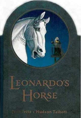
1. Book Shape and Size – Leonardo’s Horse by: Jean Fritz – Don’t you think this book is unique with a beautiful horse on the shapely cover? You just have to pick it, and then why not open it to the first page…
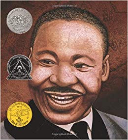
2. Binding, Dust jacket, Cover, and End Papers – Martin’s Big Words by: Doreen Rappaport. This book has the handsome engaging smile of Dr. Martin Luther King that captures your attention. The image sets the tone for a great read ahead. It has won many awards too!
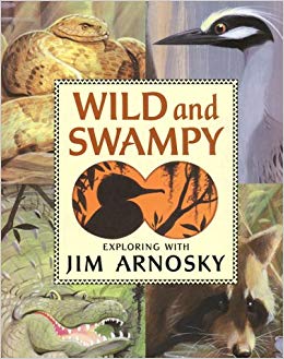
3. Page Layout- Wild and Swampy by: Jim Arnosky. The pages have beautiful pictures of animals with boxes overlaid with facts.
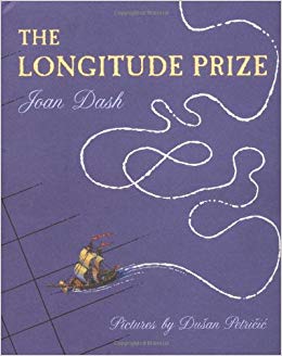
4. Typography – The Longitude Prize by: Joan Dash. Her use of fonts, print size, shape, space and the way she displays these all together create a style of her own. It’s a cool way to entice readers to keep reading this history book for children.
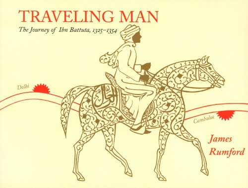
5. Paper and Ink – Traveling Man: The Story of Ibn Battuta by: James Rumford. The ink drawings in this book seem like they were lifted from the annals of time. They steep you in the history of Ibn’s journey.
We all know how the chubby, hard to turn baby book pages appeal to a baby. This is true for every reader. Students must delight in the book they are reading. A book must appeal to a reader before he opens it. If you want a child to choose the right book, first he must like what he sees. Looks really do matter!